
Pink has shed its reputation as a juvenile color. When approached with intention, it creates restful, sophisticated bedrooms that balance warmth and restraint. The key is moving beyond bubble-gum pastels and embracing tones that work with architectural details, quality materials, and purposeful lighting. A grown-up pink bedroom isn’t about trend-chasing, it’s about choosing the right shade, pairing it intelligently, and integrating it into a space that feels both personal and polished. Whether refreshing an existing room or starting from studs, these strategies help homeowners execute pink decor with confidence and skill.
Key Takeaways
- Grown-up pink bedroom decor relies on muted tones like dusty rose and blush that promote relaxation and pair well with architectural details and quality materials rather than trend-driven pastels.
- Test paint samples on multiple walls over 48 hours before committing, as pink’s appearance shifts dramatically with natural and artificial lighting throughout the day.
- Pair pink with sophisticated secondary colors like charcoal gray, navy blue, or sage green, and always use warm white lighting (2700K–3000K) to enhance rather than distort the color.
- Choose furniture with clean lines and layered materials—such as wood frames with stone tops—and prioritize quality textiles like linen, bouclé, and wool to create a curated, adult aesthetic.
- Maintain restraint with accessories by selecting only functional or meaningful pieces, using large-format mirrors and artwork with muted palettes to expand space while preserving calm.
- Invest in layered, dimmable lighting with bedside lamps and wall sconces to control the mood and ensure pink tones appear elegant at any time of day.
Why Pink Works in Adult Bedroom Design
Pink occupies a unique position on the color spectrum: it carries warmth without the energy of red and softness without the starkness of white. Studies in color psychology indicate that muted pinks can lower heart rate and promote relaxation, making them functionally appropriate for sleep spaces.
From a design standpoint, pink reflects light differently than neutrals. Blush and terracotta pinks catch morning sun and amplify it gently, while dusty rose tones absorb evening light to create a cocooning effect. This behavior makes pink especially useful in bedrooms with limited natural light or awkward window placement.
The material palette available in pink has also matured. Homeowners now have access to linen weaves, wool-blend upholstery, and porcelain tile in sophisticated pink tones that hold up to daily use. These aren’t cosmetic touches, they’re structural and functional choices that happen to carry color. When pink appears in durable, well-constructed materials, it reads as deliberate rather than decorative.
Choosing the Right Shade of Pink for Your Bedroom
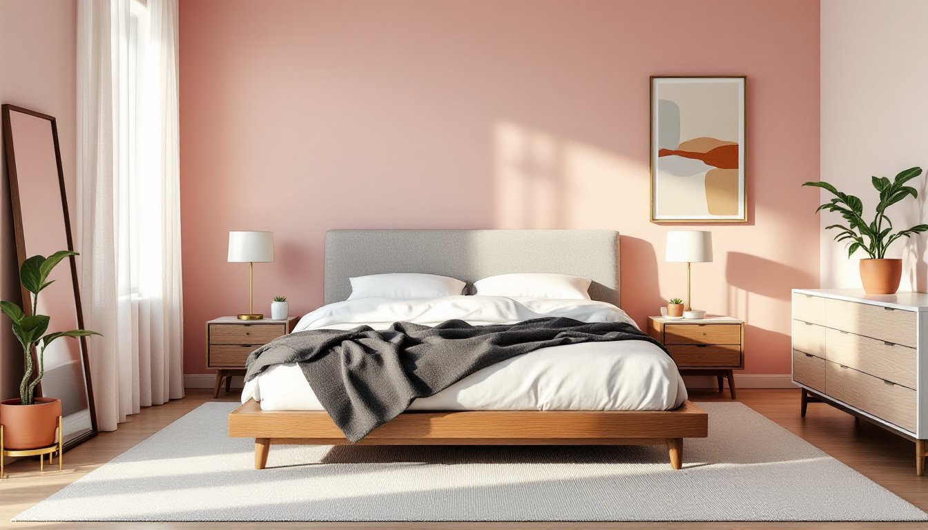
Shade selection determines whether a pink bedroom feels composed or chaotic. Dusty rose and mauve sit close to gray on the spectrum, which helps them recede visually and work in smaller rooms (under 120 sq ft). Blush pink leans peachy and pairs well with warm wood tones like white oak or walnut. Terracotta pink brings earthiness and works in rooms with existing brick, exposed aggregate, or natural plaster finishes.
Test paint samples on at least two walls, one that receives direct light and one in shadow. Paint behavior shifts throughout the day, and a shade that looks sophisticated at noon may turn saccharine under incandescent bulbs at night. Apply a 12″ × 12″ sample and observe it over 48 hours before committing to full coverage.
Undertone matters. Pinks with gray undertones (common in classy pink bedroom decor schemes) maintain neutrality and won’t clash with existing trim or flooring. Pinks with orange undertones coordinate with warmer palettes but can intensify under warm LED lighting. If the bedroom has cool-toned elements, chrome fixtures, marble, or cool-gray carpet, stick with blue-based pinks to avoid visual discord.
For accent walls, consider the room’s architecture. A pink feature wall behind the headboard works if the bed is centered and the wall is uninterrupted by windows or doors. Painting a wall with a radiator, closet door, or electrical panel creates clutter, not emphasis.
Sophisticated Color Combinations That Complement Pink
Pairing pink with intentional secondary colors elevates it beyond single-note decor. Charcoal gray grounds pink and provides contrast without harshness, ideal for bedframes, area rugs, or window treatments. Navy blue introduces depth: it’s especially effective in velvet or matte-finish textiles where the color absorbs rather than reflects light.
Sage green and dusty pink create a low-contrast, organic pairing that works well in bedrooms with plants or natural-fiber rugs. This combination benefits from texture variation, smooth painted walls against rough linen or nubby wool, to avoid flatness.
Warm whites and creams are non-negotiable supporting players. They provide visual rest and highlight pink as the primary color without competing. Use warm white (2700K–3000K) for trim, ceiling paint, and baseboards. Stark white (cool white above 4000K) will make pink look dingy by comparison.
Brass and aged bronze metallics add warmth without the coldness of chrome or nickel. These finishes appear in light fixtures, drawer pulls, curtain rods, and picture frames. Limit metallic finishes to two per room to maintain cohesion, mixing brass, chrome, and oil-rubbed bronze in one space reads as indecision, not eclecticism.
Avoid pairing pink with high-chroma colors like electric blue, bright yellow, or saturated orange unless designing for a maximalist aesthetic. These combinations require skill to balance and can quickly feel juvenile or visually exhausting in a sleep environment.
Furniture and Textile Choices for a Mature Pink Bedroom
Furniture in a pink bedroom should lean toward clean lines and solid construction rather than ornate detailing. A platform bed in walnut or white oak anchors the room without fussiness. Upholstered headboards work well in linen, bouclé, or velvet, choose mid-toned grays, taupes, or even a tonal pink slightly deeper than the wall color.
Nightstands and dressers benefit from mixed materials: wood frames with stone tops, or metal bases with wood drawers. This layering prevents the room from reading as too matchy or flat. Avoid furniture sets sold as a package: they often lack the individuality that makes a space feel curated.
Textiles carry the bulk of tactile interest. Linen duvet covers in white, cream, or soft gray allow pink walls to remain the focus. Layer with a waffle-weave blanket or a chunky knit throw in charcoal or oatmeal for contrast and warmth. Pillowcases can introduce subtle pattern, ticking stripes, small-scale geometric prints, or washed chambray, without overwhelming the palette.
Area rugs define the footprint and absorb sound. A low-pile wool rug in gray or natural fiber (jute, sisal) provides durability underfoot. If adding pattern, choose rugs with muted, multi-tonal designs rather than high-contrast graphics. Rug size matters: aim for at least 8′ × 10′ in a standard bedroom so the rug extends 18″–24″ beyond the sides and foot of the bed.
Window treatments should control light without adding visual weight. Linen or cotton drapes in off-white or light gray work for most applications. Install the curtain rod 4″–6″ above the window frame and ensure panels are wide enough to stack fully off the glass when open. This approach maximizes natural light and makes ceilings feel higher.
Accent Pieces and Accessories That Add Elegance
Restraint defines sophisticated accent work. Instead of scattering decor across every surface, select a few high-quality pieces that serve a function or tell a story.
Mirrors amplify light and visually expand space. A large-format mirror (minimum 30″ × 40″) with a simple brass or matte black frame leans against the wall or hangs above a dresser. Avoid ornate, beveled, or distressed frames, they compete with the softness of pink rather than complementing it.
Artwork introduces personality without clutter. Choose pieces with muted palettes, charcoal sketches, sepia-toned photography, or abstract works in gray, blush, and cream. Frame artwork in simple wood or metal frames and hang at eye level (center of the piece at 57″–60″ from the floor). Gallery walls work if planned carefully, but a single large piece often has more impact.
Plants add life and improve air quality. Snake plants, pothos, and rubber plants tolerate low light and require minimal maintenance. Use ceramic or terracotta planters in white, gray, or natural clay, skip overly decorative pots that introduce visual noise.
Books and objects on nightstands or shelving should be edited ruthlessly. Stack three to five hardcover books, add a small ceramic dish for jewelry, and leave space empty. Clutter undermines the calm a well-designed pink bedroom is meant to provide.
Avoid tchotchkes, faux florals, or overly themed decor. Every item in the room should either be functional or genuinely meaningful, not just filling space.
Lighting Strategies to Enhance Pink Tones
Lighting can make or break pink decor. The wrong color temperature will turn a sophisticated blush into bubblegum or drain it into dull beige.
Use warm white bulbs (2700K–3000K) across all fixtures. This range enhances pink’s warmth without distorting it. Avoid daylight bulbs (5000K+), they render pink flat and institutional.
Layer lighting for flexibility. Overhead fixtures (ceiling-mounted or a centered pendant) provide ambient light. Add bedside table lamps with fabric or linen shades for task lighting. Dimmable switches allow adjustment based on time of day and activity: install a standard dimmer (compatible with LED bulbs) for around $15–25.
Wall sconces flanking the bed or mounted above artwork reduce reliance on overhead lighting and create intimacy. Install sconces 60″–66″ from the floor and 8″–12″ out from the wall, depending on arm length. Hardwiring sconces requires basic electrical work, running 14/2 NM-B cable from a junction box to the fixture location. If the room isn’t already wired for sconces, hire a licensed electrician. Most jurisdictions require permits for new electrical runs.
Avoid cool-toned LED strips or RGB smart bulbs that cycle through colors. They undermine the carefully chosen palette and rarely integrate well with thoughtful design.
Natural light is the best light. If privacy allows, skip heavy drapes during the day. If privacy is necessary, use sheer linen panels or top-down/bottom-up cellular shades that allow light in while obscuring sightlines.
Conclusion
A grown-up pink bedroom succeeds when color, material, and light work in concert. It’s not about following a single aesthetic, it’s about making deliberate choices that reflect both function and taste. Test paint samples, invest in quality textiles, control lighting temperature, and edit accessories with a critical eye. Done well, pink becomes a background that supports rest and a foreground worth appreciating.